So, most of these links and articles are concerning Responsive Web Design – a particular focus of mine at the moment as my second large responsive project gets underway. The first was for a Fermanagh based hotel – the second for a new project from the people behind Donegal Cottage Holidays which is going to be based entirely around WordPress. Using WordPress for Responsive Design does not inherently cause any problems … you can create themes for it without the CMS part of WordPress getting in the way. The bigger challenge however is that this website will be opened up to users who – to a degree – will be able to add their own content and edit their images etc. So, keeping it responsive will be the challenge.
Anyway, this has been my recent reading:
5 tips for building a responsive wordpress site – as you can imagine, this is required reading for me right now!
Working out a responsive web design workflow is also hugely challenging. The old methods of wire framing, designing and coding aren’t necessarily appropriate. Mark Boulton here gives his thoughts as clearly as ever.
Some responsive navigation patterns nicely explained by Brad Frost. In short – what do you do with all that navigation when you’re working a smaller screen?
A massive list of Mobile Design Resources – does exactly what it says on the tin.
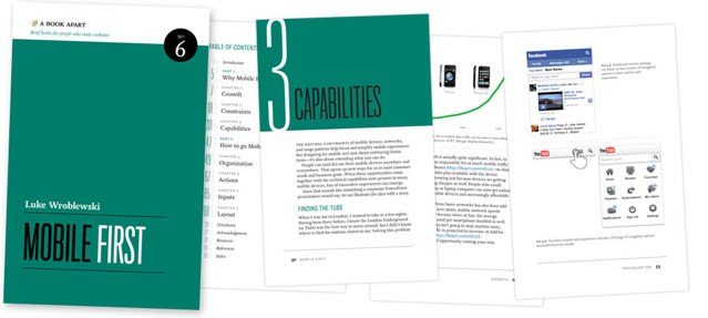
Luke Wroblewski wrote the excellent Mobile First book and he’s as prolific as ever over on his blog with a series of excellent conference notes: The future of CSS, Adaptive Web Content and Busting Mobile Myths – all talks given (not by Luke) at recent events that Luke has then typed up for those of us unable to, y’know, just fly to Seattle for these things.
Finally, recently on The Big Web Show – a great podcast covering ‘all things web’, Kristofer Layon joined Jeffrey Zeldman and talked about ‘Mobilizing Web Sites: Strategies for Mobile Web Implementation‘ – Kristofer’s recent book.
So, plenty of reading to do!