
Sometimes, a responsive web design is not the most appropriate way to develop a company’s mobile presence. There, I said it. Recently, all the talk is about responsive design – justifiably for the most part; it is a genuinely significant change for a lot of clients who now need to consider how and where their websites are viewed, beyond the desktop. And for web designers it’s probably the most significant change in development practices since we all decided that HTML and CSS were a better way to build sites than Flash. But it’s not always appropriate.
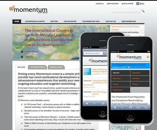
A recent case in point is the work I’ve been doing for Momentum Events. It’s a big WordPress site with a lot of custom plugins, a lot of content, a lot of assets (PDF downloads, etc.), a lot of traffic, and a good number of mobile users.
We took the decision to design & develop separate desktop and mobile sites. In this way, we would serve up code bases that were substantively different from each other (something made straightforward with WordPress and the addition of the excellent ‘Any Mobile Theme Switcher Pro‘ plugin) and provide tailored user experiences as a result.
But why? Why didn’t we do the same thing – but with a responsive design?
Well, okay, we could have. Mostly. But here’s the thing: pages are big, and mobiles are slow. The home page for Momentum has 22 images on it – most of them are ‘lazily loaded’ so they don’t exert a page weight immediately – i.e. they don’t impact download time of the page – but still, on a mobile device, that’s going to slow the site down considerably. (A common mistake when developing for mobile is assuming that everyone everywhere has a decent connection. Well, I’m in rural Ireland, my client is in Manhattan – I can tell you this: we have very different expectations of our mobile network speeds!)
Additionally, the home page connects to LinkedIn, Twitter, Facebook and Google Plus. That’s a lot of external connections that we don’t have control over. Again, these will be loaded in such a way as to not impact the download of the home page – but on a mobile device, they’ll potentially create a ‘stuttering’ experience whilst the connections are made.
A page size of a few Mb’s is not ideal on a desktop browser – but on a mobile browser it becomes downright irresponsible. As Brad Frost points out:
One of the biggest challenges of creating responsive web designs is the balancing act of delivering a full experience while still maintaining a snappy user experience across the board
Across the board, only 3% of small screen versions of websites are significantly lighter than their desktop equivalents. That’s not good.
But yes, we could have developed our site to be within that 3% (and given ourselves shiny apples and gold stars as reward). But still – we chose a dedicated site.
For us, it came down to context and relevance in the end. Our feeling was that – for business users looking to find out about business conferences – we wanted to present different information – information that was more relevant – in a mobile context. So, the home page of the site for the desktop version talks about ‘big picture’ things (mission statements, business partners, company brochure) as well as the events themselves – but the mobile version of the home page – that’s all about the events. Just a simple list of events that makes it super easy to get right into the guts of the content.
A dedicated event page of the desktop version – again, that has a richer experience for the user: speaker photos, connection information, twitter stream, LinkedIn Group information, and so on. The mobile version of the same page is much much lighter – and arguably more focussed.
Using good responsive design techniques – and a true ‘mobile first’ approach, you could deliver much of this: if it is simply a matter of loading more content as screen resolutions increase, and changing the styles as you go, then you can use perfectly solid (albeit javascript dependent) responsive techniques to achieve this.
However, if you want to serve up substantively different content to different devices then perhaps a dedicated mobile site is the way to go after all. You can achieve it quite readily, without a lot of the attendant headaches you may get when attempting the same effect responsively.