So then, the time has come to start a client project from scratch using purely responsive techniques (as defined by Ethan Marcotte’s book Responsive Web Design). I’ve retro-fitted some responsive techniques to previous client sites, but this will be the first ‘responsive’ project I’m starting from scratch. The three core ‘ingredients’ for this responsive website are:
- A flexible, grid based layout
- Flexible images and media
- Media queries
If, at this point you’re going ‘huh, what?’, then in essence I want to create a website that responds to the restraints and opportunities offered by the readers device – using the same code base. So, rather than serving a separate, mobile version of a website, I’m going to code one version that will work across devices. That’s the plan anyway.
What am I working with?
To help out with this, I’ll be using the Less.app – a pre-processor for CSS, cutting down my coding time immeasurably (that’s the theory), and the Semantic Grid – developed by the same guy as Less.app. Everything will be hand coded – and then converted into a WordPress theme.
And the project?
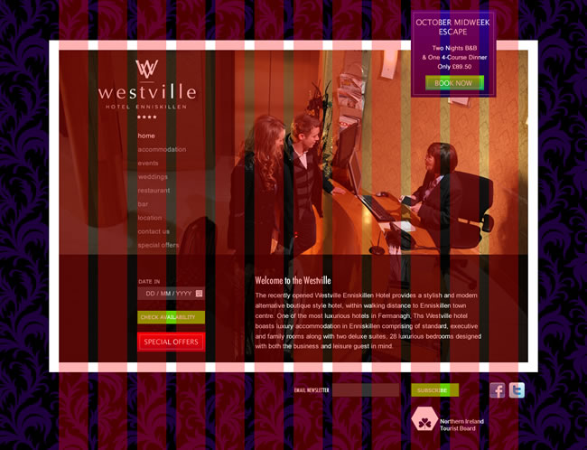
So, the client is The Westville Hotel – and below is a JPG of the design – with the 960px grid super-imposed on top.
My aim is to blog through the different stages of the development … the first stage will be to fire up Less.app and start working with the Semantic Grid. I’ll let you know how I get on …