It’s great to see more and more responsive web design going on … and this wonderful showcase highlights some of the best current work.
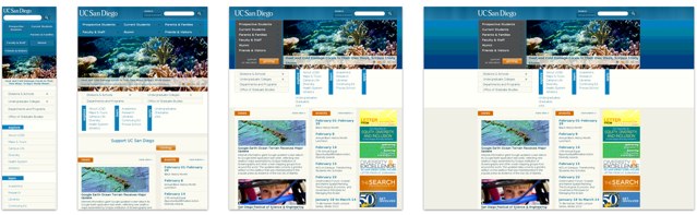
This example from the University of California in San Diego is lovely – a good, strict responsive grid. It doesn’t try to do too much, but each screen resolution looks native and as if it were built specifically for that screen size. Perhaps the navigation, at the smallest width, is a bit clunky – but it’s very effective and overall a really good example.
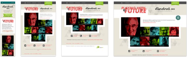
You might expect it from dConstruct – a digital media conference that takes place in Brighton each year – but this is still a wonderful example. If you define responsive web design as having fluid grid, flexible images, and media queries – then this does the lot extremely well. A nice example all round.
I’ll be keeping an eye on the Media Queries gallery for sure.